
This is probably the best demolition of the "consensus" claim yet. Picking any climate trend one way or the other is poorly grounded so far
by climatologist Chip Knappenberger
Accusations of cherry-picking—that is, carefully choosing data to support a particular point—are constantly being hurled around by all sides of the climate change debate. Most recently, accusations of cherry-picking have been levied at analyses describing the recent behavior of global average temperature. Primarily, because claims about what the temperature record says run the gamut from accelerating warming to rapid cooling and everything in between—depending on who you ask and what point they are trying to make.
I am often asked as to what is the “right” answer is. What I can say for certain, is that the recent behavior of global temperatures demonstrates that global warming is occurring at a much slower rate than that projected by the ensemble of climate models, and that global warming is most definitely not accelerating.
Choice of Cherries
But as to questions concerning just how far beneath climate model predictions the rate of warming is, or for just how long the average temperature of the world has not warmed at all, the answers depend on several things, among them the dataset you want to use and the time period over which you examine—i.e., which cherries you wish to pick.
Figure 1 illustrates the various cherry varieties that you have to choose from. It shows the global temperature history during the past 20 years as compiled in five different datasets (three representing surface temperatures, and two representing the temperatures in the lower atmosphere as measured by satellites—the latter being relatively immune form the data handling issues which plague the surface records).
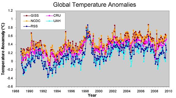
Figure 1. Global temperature anomalies from September 1989 through August 2009 as contained in five different data compilations. The GISS (Goddard Institute for Space Studies), NCDC (National Climate Data Center), and CRU (Climate Research Unit) data are all compiled from surface records, while the RSS (Remote Sensing Systems) and UAH (University of Alabama-Huntsville) data are compiled from satellite observations of the lower atmosphere.
To give you some guidance as to which cherries to use to make which ever point you want, I have constructed a Cherry-Pickers Guide to Global Temperature Trends (Figure 2).
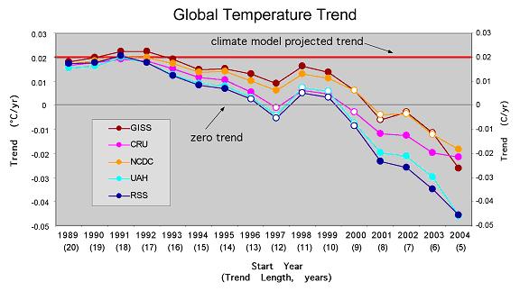
Figure 2. Cherry-Pickers Guide to Global Temperature Trends. Each point on the chart represents the trend beginning in September of the year indicated along the x-axis and ending in August 2009. The trends which are statistically significant (p<0.05) are indicated by filled circles. The zero line (no trend) is indicated by the thin black horizontal line, and the climate model average projected trend is indicated by the thick red horizontal line.
It shows the current value (though August 2009) of trends of various lengths from all of the five commonly used global temperature compilations. I compute the trends as simple linear least-squares fits through the monthly global average temperature anomalies for each dataset (from Figure 1). Each point in Figure 2 (for each dataset) represents the trend value for a different length period, beginning in September in the year indicated along the horizontal axis and ending in August 2009.
Starting in September of particular year and ending in August of this year produces a trend with a length expressed in units of whole years. For example, a trend starting in September 1999 and ending in August 2009 include 120 months, or 10 complete years. The values for the 10-yr trend for each dataset are plotted on the chart directly above the value on the horizontal axis labeled 1999. If the trend value is statistically significant at the 1 in 20 level (p<0.05), I indicate that by filling in the appropriate marker on the chart.
I also include several other items of potential interest to the cherry harvesters; first is the dotted horizontal line representing a trend of zero—i.e., no change in global temperature, and second, the thick red horizontal lines which generally indicates the average trend projected to be occurring by the ensemble of climate models. Bear in mind that red line only represents the average model expectation, not the range of model variability. So it shouldn’t be used to rule out whether or not a particular observed value is consistent with model expectations, but does give you some guidance as to just how far from the average model expectation the current trend lies (a cherry picker is not usually worried about the finer details of the former, but, instead, the coarser picture presented by the latter).
General Conclusions
Here are a few general statements that can be supported with using my Cherry-Pickers Guide:
• For the past 8 years (96 months), no global warming is indicated by any of the five datasets.
• For the past 5 years (60 months), there is a statistically significant global cooling in all datasets.
• For the past 15 years, global warming has been occurring at a rate that is below the average climate model expected warming
And here are a few more specific examples that the seasoned cherry-picker could tease out:
• There has been no (statistically significant) warming for the past 13 years. [Using the satellite records of the lower atmosphere].
• The globe has been cooling rapidly for the past 8 years. [Using the CRU and satellite records]
Or on the other side of the coin:
• Global warming did not ‘stop’ 10 years ago, in fact, it was pretty close to model projections. [Using the GISS and NCDC records beginning in 1998 and 1999]
• Global warming is proceeding faster than expected. [Using the GISS record staring in 1991 or 1992—the cool years just after the volcanic eruption of Mt. Pinatubo]
I am sure the more creative of you can probably think of many others.
Judging the Cherry Pickers
Another use of my Cherry-Pickers Guide besides choosing your own analysis, is to check and see what level of cherry-picking was required to support some statement of the behavior of global temperatures that you saw somewhere.
For instance, in a recent post over at RealClimate.org, Stefan Rahmstorf used about 10-yr to 11-yr trend in the GISS dataset to support the idea that global warming was proceeding pretty much according to plan, concluding “the observed warming over the last decade is 100% consistent with the expected anthropogenic warming trend of 0.2 ºC per decade, superimposed with short-term natural variability.”
A quick check of my Guide would show how carefully Rahmsdorf’s selection was made. Trends a few years longer or a few years shorter that the period selected by Rahmstorf would not have borne out his conclusion with as much conviction.
Another example of careful data selection can be found in recent claims made by Richard Lindzen who is fond of stating that “there has been no statistically significant net global warming for the last fourteen years.” A quick check of my Cherry-Pickers Guide shows Lindzen to be particularly crafty because there is no support for such a statement in any of the five datasets. So how did he arrive at that conclusion? By using annual data values instead of monthly data. Using fewer data points (14 annual values instead of 168 monthly ones) doesn’t affect the actual trend value so much, but it does affect the statistical significance of the trend. The fewer data points you use, the less significant the trend is. So by using annual data (from the CRU or satellite datasets), Lindzen is able to cite a 14-yr temperature trend that is not statistically significant.
The statements by Rahmstorf and Lindzen are not wrong, per se, but neither are they particularly robust.
So next time you encounter some claims about what recent temperatures tell us about global warming, or want to make one yourself, check my Cherry-Pickers Guide to get a full appreciation for the degree of grounding that such statements enjoy. And for those folks who want to push the envelope a bit, you’ve got to hope that your audience doesn’t have access to my Guide—otherwise, someone, somewhere, is sure to call you on it!
SOURCE
Deafening Silence on Real Climate Change
Antarctic Ice Melt Lowest Ever Measured. Where’s the headline? Where’s the television camera? Anyone out there? It’s right there in the September 24 issue of the refereed journal Geophysical Research Letters. The senior author is Marc Tedesco of City College of New York, not exactly off the mainstream media’s beaten path. The work was sponsored by NASA.
Every summer (our winter), the edges of Antarctica warm up just enough for some snow to melt. Obviously, a little warming will create quite a bit more melting, which is a factor in dreaded sea-level rise from global warming.
Satellites have been monitoring this activity in both the North and South polar regions since 1980. What Tedesco wrote was this: “A 30-year minimum Antarctic snowmelt record occurred during austral summer 2008-09”.

It’s obvious that it’s not just this year that is of interest. The last three years are clearly those with the lowest aggregate melt on record. You might even see a downward trend since the beginning of the record in 1980.
It’s a reasonable surmise that there was no press coverage because there was no press release. NASA is keeping this thing hushed up. (We wouldn’t expect environmental journalists to occasionally glance at the scientific literature, such as Geophysical Research Letters, right?). The Agency is also highly selective about the global warming science it chooses to trumpet. For example, Tedesco has also published on melting in Greenland, and NASA wrote press releases on those papers, which were not nearly as newsworthy as the thirty-year decline in Antarctic melt. Examples:
May 29, 2007: NASA Researcher Finds Days of Snow Melting on the Rise in Greenland. “In 2006, Greenland experienced more days of melting snow and at higher altitudes than average over the past 18 years.” Stop the presses! The last we heard each and every year has a fifty-fifty chance of being above (or below) average.
September 20, 2007: NASA Researchers Find Snowmelt in Antarctica Creeping Inland. “…Only satellites can fully capture the extent of changes in snow melting…researchers [including Tedesco] …confirmed that Antarctic snow is melting farther inland…melting at higher altitudes than ever, and increasingly melting on Antarctica’s largest ice shelf.” How on earth does this square with the obvious decrease in melt just published by the same researchers? Doesn’t this press release demand another on the newer work?
Earth to NASA: The 2007 Antarctic paper used twenty years of data, the 2009 paper has the entire record back to 1980. Even looking at the graph through 1998, it’s apparent that there is no net increase in melt.
September 25, 2007: NASA finds Greenland Snow Melting Hit Record High in High Places. This one is unbelievably misleading. “In fact, the amount of snow that has melted this year over Greenland is the equivalent of more than twice the surface size of the U.S.”. This is patently impossible – as Greenland’s total area is about a quarter of that of the lower 48 states.
There’s more. In the most recent paper, Tedesco and his co-authors take pains not to step on a highly publicized study of surface temperature trends published by University of Washington’s Eric Steig that was hailed as evidence for human-induced warming. At the time it was published, critics pointed out that there was no trend whatsoever in recent decades and that what warming had occurred took place before the great increase in atmospheric carbon dioxide.
Indeed, Tedesco begins his conclusions by stating that his results “do not contradict” the Steig study. Why? According to Tedesco, because Steig’s work begins in the 1950s, long before his 1980 start date. All this did was to confirm that warming pretty much stopped three decades ago. Where’s that press release?
NASA’s seems to beat the drum only when the news on global warming is bad, and remains mute when it is good. And, for that matter, so is that of the environmental journalism community, apparently incapable of filing an original story about an article from a refereed scientific journal that flies in the face of previous reportage on climate change.
SOURCE
A big chill on global warming
Something important is happening when even the BBC is compelled to ask, as it did this week, "What happened on global warming?" The British news organization has heretofore insisted that the scientific consensus was cemented long ago that global warming is real and is mainly caused by human use of carbon-based fossil fuels. Put simply, what has happened is global temperatures have dropped every year since 1998, recent peer-reviewed research has uncovered the decisive influence of hot and cold cycles in the oceans on land temperatures, and growing numbers of scientists with unquestioned credentials are stepping forward to question the conventional wisdom.
But reaching a new consensus will be exceedingly difficult because the raw data on which the landmark 1996 United Nations Intergovernmental Panel on Climate Change based its conclusion has been destroyed. The University of East Anglia's Climate Research Unit acknowledged in August that it discarded data that, in addition to the IPCC report, has been cited by other international studies as the main justification for severe restrictions on carbon emissions worldwide. This development raises more troubling doubts about global warming just as scientists and policymakers are expected to call for harsh new limits on energy use in its name when they meet in December in Copenhagen, Denmark.
Every schoolchild knows that the last step in the scientific method is independent reproduction of results. But lost climate data cannot be reproduced, which is a huge problem for everybody. "Every time CRU massaged the temperature data, they were getting more warming from the same numbers. It's incumbent upon scientists to find out why, but you can't find out if you don't have the data," Dr. Patrick Michaels, senior fellow in environmental studies at the Cato Institute, told The Examiner. "The data needed to verify the gloom-and-doom warming forecasts have disappeared."
The Competitive Enterprise Institute has formally requested that the Environmental Protection Agency, which helps fund CRU, "reopen the record" and allow CEI and others to submit newly uncovered information regarding the East Anglia data destruction. The conservative think tank also wants to submit information about flaws in other data EPA is using as it devises stringent new anti-global warming regulations. Congress should also investigate the dumping of data partially paid for by U.S. taxpayers and other suspicious global warming anomalies, such as the temperature readings taken from "ghost weather stations" like the one at Maine's Ripogenus Dam. It was officially closed in 1995 but allegedly is still transmitting climate data 14 years later. Such questionable data sources must be eliminated if credible policy decisions are ever to be reached.
SOURCE
TOP TEN REASONS WHY THE CATLIN ARCTIC ICE SURVEY CAN'T BE TRUSTED
WUWT followed the entire activist affair disguised as a science expedition from the start. You can see all of the coverage here. It’s not pretty. When I say this expedition was the “scientific joke of 2009″, I mean it.
Top Ten Reasons why the Catlin Arctic Ice Survey data can’t be trusted
10. High profile news and PR from the beginning, plus an unrealistic vision of self importance related to the mission. The entire venture was publicized well in advance of the actual expedition, and the mission was “too important to fail” according to the January 23rd interview with The Guardian Catlin team leader Pen Hadow said: “During this mammoth expedition we will gather the essential data that scientists need to more accurately determine when the permanent floating sea ice will disappear altogether. We cannot afford to fail on this mission – there is too much at stake.”
With pronouncements like that, you also can’t afford not to bring home a result consistent with the theme of the expedition.
9. Reality Show Science as reported here, “The trio will be sending in regular diary entries, videos and photographs to BBC News throughout their expedition.” When you tie science too closely to the media from the beginning, it predetermines some outcomes. That pressure is always there to produce the story rather than focus on the task. This is why most proper science is done well away from the media and the results are reported afterwards.
8. Hadow, by his own admission, has an unrealistic and biased warmer view of the Arctic that doesn’t match the current data. In his Curriculum Vitae posted here, he writes: “Twenty years ago, you could walk to the North Pole – now you have to swim part of the way there.”
Only problem is, the satellite data showed a completely different picture of solid ice, and Hadow’s expedition encountered temperatures of -44F (-42C) along the way, and the vast majority of the trip was below 32F (0C). He didn’t encounter vast leads of water along the way, and in fact encountered ice conditions far worse than he expected. This shows his bias for a warmer trip from the start.
7. The Catlin team’s scientific advisor at the beginning of the trip seemed to already have a predetermined outcome for the Arctic. In this BBC article and interview they write of Professor Wieslaw Maslowski, a science advisor to the survey: “Ultimately, Professor Maslowski hopes to finesse his forecast for when the first ice-free summer might arrive. Currently, he has it down for 2013 – but with an uncertainty range between 2010 and 2016.”
So if they already had this figured out from the beginning, why make the trip at all? Is it so the BBC could recycle the headline again today saying Arctic to be ‘ice-free in summer’? Why do “science” at great personal risk when you already are sure of the end game? There’s also another nugget of predisposition wisdom by Catlin’s science advisor Professor Maslowski. Read on.
6. They failed to advise of major equipment failure in a timely manner, inviting suspicion. The ice radar sounding equipment that was designed to do the thickness survey failed miserably, almost from day one, yet even though they were “sending in regular diary entries, videos and photographs to BBC News throughout their expedition,” the world didn’t learn of that failure until day 44 of the 73 day expedition. When Apollo 13 had a problem, the world knew about it almost immediately. When Catlin had a problem, it was covered up for well over a month, yet that didn’t stop the BBC from paraphrasing Apollo 13’s famous words for a headline ‘London, we have a problem’ as if there was some parallel in integrity and timeliness here.
5. Hadow and his scientific advisor erroneously believed that their expedition was the only way ice thickness measurements could be done, and they seemed oblivious to other efforts and systems.
From this BBC article and interview: “No other information on ice thickness like this is expected to be made available to the scientific community in 2009,” explained Arctic ice modeller Professor Wieslaw Maslowski, a science advisor to the survey.
While this was obviously a selling point to sponsors and an ego boost for the team, it was flat wrong. For example, there’s a bouy network that provides ice thickness data,. Then there’s ICEsat which provides mass and balance measurements, as well as ice thickness maps, shown below:
As reported on WUWT, another data source of Arctic Ice thickness in 2009 came in the form of an aerial survey with a towed radar array from the Alfred Wegener Institute for Polar and Marine Research. They didn’t have to risk lives, create drama, or bleat constant headlines to the BBC while doing the science. They simply flew the plane over the ice a few times.
Here’s some excerpts of what was reported on WUWT in the story Inconvenient Eisdicken – “surprising results” from the Arctic: At the North Pole ice sheet is thicker than expected
The “Polar 5″ in Bremerhaven
The research aircraft Polar 5 “ended today in Canada’s recent Arctic expedition. During the flight, researchers have measured the current Eisstärke measured at the North Pole, and in areas that have never before been overflown. Result: The sea-ice in the surveyed areas is apparently thicker than the researchers had suspected.
Normally, ice is newly formed after two years, over two meters thick. “Here were Eisdicken up to four meters,” said a spokesman of Bremerhaven’s Alfred Wegener Institute for Polar and Marine Research. For scientists, this result is still in contradiction to the warming of the seawater.
Gosh. Where’s the polar death defying drama in that?
4. Due to the extreme cold conditions they were not fully prepared for, they completed less than half of the planned trip. Originally it was to be a 1000 kilometer trip to the North Pole which according to early interviews given by Hadow was easily done, yet they failed. The original start point was to be at 81N 130W but they actually started closer to the pole by about 100 kilometers.
According to the Google Earth KML file provided by Catlin, they started at 81.7N 129.7W and ended at 85.5N 125.6W for a total distance of approximately 435 kilometers over 73 days. Hardly a broad survey of the Arctic Ice when put into perspective on the Google Earth and ICEsat maps shown below:
Note that the ICEsat image is from Fall 2008, while the Catlin trip was in the Spring of 2009. Since we all know sea ice moves, often connected to the Beaufort Gyre, it is likely that the path depicted does not represent the ice Catlin actually traveled over. The sea ice may have moved so that the Catlin path traversed some of the thinner ice to the west, though some thickening of the ice would also be expected during the winter of 2009. The point of this map was to put the route in perspective.
3. There’s very little actual data return for 73 days on the ice, only 39 datapoints. See the dataset they provide in the Excel file here: CAS Snow Ice Measurements – Final 2009 - Final surveying results from the 2009 expedition.
The actual number of holes drilled and measured for ice thickness by Pen Hadow is said to be in the hundreds, and what we see in the Excel file is the average of those many holes at each drilling session. While I commend them for providing the raw hole data, problems with potential measurement bias don’t appear to be well addressed in the methodology paper they provide here (PDF) while it is mentioned in the preliminary June report: “One further consideration, when interpreting the ice thickness measurements made by the Catlin Arctic Survey team, may be navigational bias. Typically, the surface of First Year Ice floes are flatterthan that of multi‐year ice floes and because the team systematically seeks out flatter ice which is easier to travel over and camp on, there is a risk that the ice surveyed will not be representative.”
Since they make no mention of the potential measurement bias in the final report, it appears that there wasn’t anything but lip service consideration given to it in the early report, possibly to appease critics.
2. One of the most prominent sea ice researchers in the world, Dr. Walt Meier of NSIDC said he would not use the Catlin data saying in a post here on WUWT: “I don’t anticipate using the Catlin data.”
That begs the question then, beyond the use of the data for generating news stories like we’ve seen in the BBC and other media outlets, who will? Even the media outlets have ignored the actual data Catlin made available, preferring sound bites over data bytes.
1. The Catlin Arctic Ice Survey knowingly presented false data to the public and to the media in their web presentation.
As many WUWT readers recall, it was here that it was discovered that Catlin’s website had bogus telemetry data on it, giving the impression of “live data from the ice” when in fact the data repeated in an endless loop from a short period....
So the question to readers and media is: with these sorts of issues listed above, do you really want to trust the data from a group of people that perform and present “science” in this way? If you do, it would seem to me that you are putting form over substance. Even if we didn’t have these trust issues, are 39 datapoints over a short section of the Arctic really that useful given the other tools shown to be at the disposal of real science?
The Catlin Arctic Ice Survey is in my opinion, nothing more than a badly executed public relations stunt covered with the thinnest veneer of attempted science.
SOURCE
Living in Fear
"We live in an age of fear." The first line of Not Evil Just Wrong: The True Cost of Global Warming Hysteria reverberates throughout the documentary as an indictment of the modern environmental movement. The film delves deep into what the heart of environmentalism is: creating an artificial crisis and devaluing ordinary human worth.
Phelim McAleer and Ann McElhinney’s production, being released worldwide on October 18, takes global warming alarmists head-on with a convincing narrative of the methods of environmentalist panic. The movie’s principle action consists of a series of interviews from a wide-ranging group of voices, from scientists to journalists to environmental activists to expose how the environmental left manipulates the media and public opinion to propagate the anthropogenic global warming farce. Along the way, the filmmakers introduce us to leading lights in the environmental movement while highlighting some of the inexcusable fallacies the green leftists have foisted upon the world.
Over the course of the last fifty years, the modern environmental movement has attempted to turn every minor concern into an imminent crisis. One of the first major successes that they had was the worldwide demonization of the pesticide DDT. Used to great success in the United States in controlling the mosquito population and virtually eliminating malaria, environmentalists engaged in a smear campaign that led to the outlaw of the pesticide’s use in the developing world, where over one million people die every year from malaria. Exploring the DDT slur marks one of the film’s many high points, laying out the blueprint for how environmentalists will engage in an anti-science ideological campaign.
This system of crisis creation has been endemic to the modern environmentalist left. To them, every crisis needs a centrally-planned and government-administered solution. Every crisis requires a dramatic reorganization of society and the outlaw of new, useful technologies. These leftists see these crises in absolute moral terms. Conservatives take a far more reasonable approach: disagreements stem not from morality, but misunderstandings. Roy Innis, chairman of the Congress of Racial Equality and a major contributor to the film, says
“These people [environmental activists] must be forced to consider the pragmatic consequences of what they hope for or what they believe. I don’t believe that the people… are evil people. But they’re people who are just wrong.”
Not Evil Just Wrong parallels the anti-DDT campaign with current activities being undertaken by environmentalists. The playbook remains the same: the pseudo-science, the exaggerations, the personal smears and the utter lack of compassion for humanity.
The filmmakers are in their element using music and stock footage to create a contrast with statements made by their interviewees. Many of the alarmist activists interviewed are wealthy Americans who will have to sacrifice nothing in order to implement their carbon reduction goals. Actor Ed Begley is shown to admire the “happy” way of life of Fiji while footage rolls portraying the poverty of most of the inhabitants of the small island nation. Testimonials urging the Earth to give up carbon clash with images of hardworking middle-Americans that rely on cheap coal energy to power their humble lifestyles. A particularly convincing segment of the film deals with the famous debunkers of the global warming “hockey stick” graph while interviewing an academic mathematician in the middle of a hockey game.
At its heart, the film extols the virtues of a modern society and the triumph of ordinary humanity over elitist alarmism. The leading advocates of global warming, the film teaches, are its biggest hypocrites. Jet-setting politicos like Al Gore who yearn to destroy cheap energy sources won’t be harmed as a result of the policies they endorse. They never stop to consider the consequences for Americans who may not be able to afford energy that comes from windmills.
Not Evil Just Wrong is both a lesson on environmentalists’ method of crisis creation and an expose on their disregard for basic humanity. McAleer and McIlhenney are accomplished filmmakers who put an important message into an easily-digestible package. This film is an important step to breaking the false elitist consensus on global warming and arming skeptics with important ammo to ward off the hypocrites. While the film does not break ground with people who have done their homework on the global warming mythos, it’s an indispensible introduction to the real debate that needs to occur.
SOURCE
Imagine no global warming, it's easy if you try...
Comment from New Zealand
Imagine if there was no climate change and no global warming and no problem to panic over. Imagine if the oceans were not really rising at a dangerous rate, and that when we went to the beach the tide simply came in and out as it has always done, and reached the same high water marks. Imagine if the summers were not getting so hot that we risked burning to ashes, and that there will always be hot days and cold ones as they always have been in the past. Imagine too, that the sky was not filling up with poisonous gas any time soon, and any wind around just blew it away as soon as it came out of a chimney or car tailpipe. What kind of an odd world would that be? How would regional councils pass the time without the need to endlessly debate the extent of imposing eco-regulations that may eventually govern every facet of our daily lives? Could we live in a world where no one was really certain whether or not oil was running out? Could we sleep at night, knowing that there was no obvious horrendous Armageddon looming, knowing that we did not have to pay a tax for the sunshine, for the right to light a camp fire when we slept in a tent on the beach and for the right to drive out of the city? How would we explain to our children that it was not their job to save the planet, and that they could actually enjoy their lives and go back to leaving lights on, cardigans off, and kicking aluminum cans along the sidewalk?
That the world is still beautiful, bountiful and big enough to absorb all mankind's difficulties and bungling mistakes and carry on functioning regardless is too impossible to imagine. But let's pretend that one day an enlightened scientist, coming from way left-field and acting purely on a bizarre intuitive hunch, was struck by a random thought that almost passed too quickly through his brilliant brain to be noticed, but luckily was picked up by a lonely and bored synapse that was half asleep and off duty and on vacation at the time. And further imagine that this revolutionary Nobel Prize winning at first too wacky and nonsensical thought was that weather and what caused it could be put down to a natural process. What howls of scorn, suppressed laughter and unkind guffaws would he have to endure from his peers! What a skyward rolling of the eyes when he approached, and how his family and acquaintances would be ostracized, for here would be a traitor, in league with the devil and heathen of the worst order. To entertain a notion that man was not responsible for the climate! Whatever next!
Imagine if he dared to follow that thought and see where it led. Why, it might as well occur to his brain that earthquakes and volcanoes were also part of nature, and that glaciers and ice sheets and deserts may also be subject to forces and cycles that were well beyond understanding and human influence.
There could be no stopping this insane speculation, as he might reflect that our Sun can be seen from hundreds of millions of miles away but the exhaust from a car from not half a mile, and that there is weather on other planets that oddly have no air and no emission trading schemes. He may get to wondering too, why the Arctic never keeps expanding until the whole world is covered in ice, nor does it keep reducing until there is no ice left. Rather, it seems to come and go on some regular cycle. Similarly he may notice that the mighty ocean has never kept warming until it boiled away, nor never kept cooling until it became a huge solid block of ice, but rather the temperature of that vast watery expanse seems perpetually and regularly over geological time to simply go up and down. He may also realize that almost everything that we used to call nature does go up and down, and in and out, and bigger and smaller, faster and slower, and backwards and forwards, amazingly all by itself and without our meddlesome hand. Small animals, insects and fish seem to thrive away from our kindly eyes, almost as if they had minds of their own.
But wait - this bloke's brain is just getting started. What if women did not, after all, come from someone's rib as the bible states, what if every species of animals, bird, fish and virus did not once cram into a tiny houseboat to ride out a storm, and what if whispering with your palms together does not get heard by the chap who made the world? What if Santa Claus does not live at the North Pole? What if 3 was actually unlucky? How will planting thousands of trees help change weather patterns, when weather is generated 6-8 miles up at the level Boeings fly, and trees are so far below they can't even be distinguished from land? Why are we being asked to pay for plastic supermarket bags but not for the plastic in other items, when one Coke bottle is equivalent to 50 plastic bags and one disposable nappy could make 150,000 bags?
We are more and more finding that in a previously free world, now some questions are not allowed to be asked. We cannot publicly conjecture on the effect an ETS will have on climate, for the ETS is the agenda and not transparency about the rationale for it. The government wants the ETS for two major reasons. In the grand scheme of politics, world trade and the world banking system wants it because it is another step towards world government by a banking elite that wants to suppress poorer countries so the latter can become slave labour for the west. Closer to home governments want it because the Greens want it and western governments want the Greens.The Greens want it because without it they have no point of difference and without a point of difference they are out of a job.
The irony is that following Green policies means eventually we will all be out of a job. Environmentalists do not seem to be aware that farming is not sustainable without allowing belches and farts to run footloose across our fields. Factories cannot function without workers being allowed to drive to them each morning. Food cannot stay fresh in supermarket shelves and freezers without plastic wrapping, without process and without freight. But who and what will pay for the added expenses incurred by not having these items of progress? Certainly not the Greens. We are not allowed to ask who will pick up the final bill for all these new eco restrictions, because the answer is every living breathing Australian and NZer. We are not allowed to ask how a huge thermal mass (oceans) heats dramatically and has its total acid balance disturbed due to the micro-heating from above of small thermal mass (air). Because the global warmers would be sprung with that simple silly question. By how much heat? Just 2degC over 100 years, according to the IPCC. Try putting an element that only warms to two degrees (a fluorescent bulb would do) into a big bowl of water and see if the water warms above room temperature. A lot of us have aquariums with tropcal fish. Have you noticed how they ALL simply LOVE swimming around the heater? So what's that about?? We do know that there is a major CO2 measuring station in Hawaii at a volcano, Mauna Loa. Hawaii is a major location of volcanic activity. There is a huge hot spot there. Lava is tumbling into the ocean right now. A new Hawaiian island is being formed right now. When hot lava enters the ocean, the localized heat source causes CO2 to outgas from the ocean. But we are not allowed to ask if this makes the station data biased.
But just imagine a world in which we could ask innocent questions like these and get honest answers, from someone knowledgeable and free enough to answer without fear of losing their job. Imagine if we lived in an environment of commonsense, perhaps with a Ministry of Kindness, where caring for truth became a national pursuit, and the rush to feather one's own nest or increase one's public standing came not at the expense of limiting freedoms of another, and greed, power and profit were not held up as good business ethics. That might just save human society on planet earth. And what a legacy to leave to our children.
SOURCE
***************************************
For more postings from me, see DISSECTING LEFTISM, TONGUE-TIED, EDUCATION WATCH INTERNATIONAL, POLITICAL CORRECTNESS WATCH, FOOD & HEALTH SKEPTIC, GUN WATCH, SOCIALIZED MEDICINE, AUSTRALIAN POLITICS, IMMIGRATION WATCH INTERNATIONAL and EYE ON BRITAIN. My Home Pages are here or here or here. Email me (John Ray) here. For readers in China or for times when blogger.com is playing up, there is a mirror of this site here.
*****************************************


 Jim Hansen and his twin


No comments:
Post a Comment