
The crookedness never stops
The NASA article below uses one of the oldest tricks in the book: Pick your period. By picking your period to be examined from the midst of oscillating data, you can "prove" almost anything. The article below picked two periods, one during global warming and one that included some global warming. And during both they saw more plant growth in cold regions, which is not terribly surprising. In the second one, however, there was less growth (funnily enough). So they imply that vegetation spread is still going on. Making their period the 21st century would clearly have undermined that little message
Perhaps most amusingly, the lesser growth in the period with only some global warming is attributed not to the cessation of warming but to "water limitations"!
Vegetation growth at Earth's northern latitudes increasingly resembles lusher latitudes to the south, according to a NASA-funded study based on a 30-year record of land surface and newly improved satellite data sets.
An international team of university and NASA scientists examined the relationship between changes in surface temperature and vegetation growth from 45 degrees north latitude to the Arctic Ocean. Results show temperature and vegetation growth at northern latitudes now resemble those found 4 degrees to 6 degrees of latitude farther south as recently as 1982.
"Higher northern latitudes are getting warmer, Arctic sea ice and the duration of snow cover are diminishing, the growing season is getting longer and plants are growing more," said Ranga Myneni of Boston University's Department of Earth and Environment. "In the north's Arctic and boreal areas, the characteristics of the seasons are changing, leading to great disruptions for plants and related ecosystems."
The study was published Sunday, March 10, in the journal Nature Climate Change.
Myneni and colleagues used satellite data to quantify vegetation changes at different latitudes from 1982 to 2011. Data used in this study came from NOAA's Advanced Very High Resolution Radiometers (AVHRR) onboard a series of polar-orbiting satellites and NASA's Moderate Resolution Imaging Spectroradiometer (MODIS) instruments on the Terra and Aqua satellites.
As a result of enhanced warming and a longer growing season, large patches of vigorously productive vegetation now span a third of the northern landscape, or more than 3.5 million square miles (9 million square kilometers). That is an area about equal to the contiguous United States. This landscape resembles what was found 250 to 430 miles (400 to 700 kilometers) to the south in 1982.
"It's like Winnipeg, Manitoba, moving to Minneapolis-Saint Paul in only 30 years," said co-author Compton Tucker of NASA's Goddard Space Flight Center in Greenbelt, Md.
The Arctic's greenness is visible on the ground as an increasing abundance of tall shrubs and trees in locations all over the circumpolar Arctic. Greening in the adjacent boreal areas is more pronounced in Eurasia than in North America.
An amplified greenhouse effect is driving the changes, according to Myneni. Increased concentrations of heat-trapping gasses, such as water vapor, carbon dioxide and methane, cause Earth's surface, ocean and lower atmosphere to warm. Warming reduces the extent of polar sea ice and snow cover, and, in turn, the darker ocean and land surfaces absorb more solar energy, thus further heating the air above them.
"This sets in motion a cycle of positive reinforcement between warming and loss of sea ice and snow cover, which we call the amplified greenhouse effect," Myneni said. "The greenhouse effect could be further amplified in the future as soils in the north thaw, releasing potentially significant amounts of carbon dioxide and methane."
To find out what is in store for future decades, the team analyzed 17 climate models. These models show that increased temperatures in Arctic and boreal regions would be the equivalent of a 20-degree latitude shift by the end of this century relative to a period of comparison from 1951-1980.
However, researchers say plant growth in the north may not continue on its current trajectory. The ramifications of an amplified greenhouse effect, such as frequent forest fires, outbreak of pest infestations and summertime droughts, may slow plant growth.
Also, warmer temperatures alone in the boreal zone do not guarantee more plant growth, which also depends on the availability of water and sunlight.
"Satellite data identify areas in the boreal zone that are warmer and dryer and other areas that are warmer and wetter," said co-author Ramakrishna Nemani of NASA's Ames Research Center in Moffett Field, Calif. "Only the warmer and wetter areas support more growth."
"We found more plant growth in the boreal zone from 1982 to 1992 than from 1992 to 2011, because water limitations were encountered in the later two decades of our study," said co-author Sangram Ganguly of the Bay Area Environmental Research Institute and NASA Ames.
SOURCE
Mike’s AGU Trick
Michael Mann is still fiddling the data
There has been considerable recent discussion of the fact that observations have been running cooler than models – see, for example, Lucia’s discussion of IPCC AR5 SOD Figure 9.8 (see here). However, Michael Mann at AGU took an entirely different line. Mann asserted that observations were running as hot or hotter than models.
In today’s post, I’ll look closely at the illustration in Mann’s AGU presentation, an illustration that gave an entirely different impression than the figure in the IPCC draft report. The reason for the difference can be traced to what I’ve termed here as “Mike’s AGU Trick”.
There were two components to Mann’s AGU trick. First, as in Mann and Kump, Mann compared model projections for land-and-ocean to observations for land-only. In addition, like Santer et al 2008, Mann failed to incorporate up-to-date data for his comparison. The staleness of Mann’s temperature data in his AGU presentation was really quite remarkable: the temperature data in Mann’s presentation (December 2012) ended in 2005! Obviously, in the past (notably MBH98 and MBH99), Mann used the most recent (even monthly data) when it was to his advantage. So the failure to use up-to-date data in his AGU presentation is really quite conspicuous.
Had Mann shown a comparison of Hansen’s Scenario B to up-to-date Land-and-Ocean observational data, the discrepancy would have been evident to the AGU audience, as shown in the loop below.
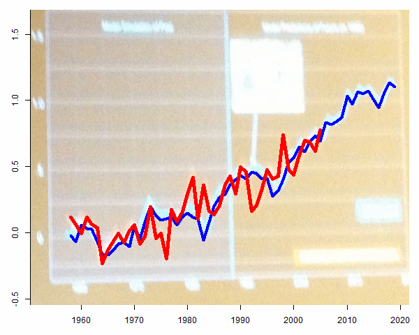
Figure 6. Excerpt from Mann’s AGU presentation. Loop 1- showing Mann’s actual diagram with GISS Land-Only to 2005; Loop 2 – showing GISS Land-and-Ocean to 2012.
Pierrehumbert Condemns Data Truncation
In a 2007 realclimate article, Raymond Pierrehumbert condemned use of non-updated temperature data, when the effect of the failure to use up-to-date data was that the image gave an entirely different impression to the reader. In that situation, Pierrehumbert even called into question the ethics of the author.
"there is no legitimate reason — in a paper published in 2007 — for truncating the temperature record at 1992 as they did. There is, however, a very good illegitimate reason, in that truncating the curve in this way helps to conceal the strength of the trend from the reader, and shortens the period in which the most glaring mismatch … occurs."
There does not appear to be any relevant difference between Mann’s AGU technique and the graphic so vehemently criticized by Pierrehumbert, though, to my knowledge, Pierrehumbert has not taken exception to Mann’s AGU Trick.
More here
Precautionary Principle in One Chart
The ultimate argument I get to my climate talk, when all other opposition fails, is that the precautionary principle should rule for CO2. By their interpretation, this means that we should do everything possible to abate CO2 even if the risk of catastrophe is minor since the magnitude of the potential catastrophe is so great.
The problem is that this presupposes there are no harms, or opportunity costs, on the other end of the scale. In fact, while CO2 may have only a small chance of catastrophe, Bill McKibben's desire to reduce fossil fuel use by 95% has a near certain probability of gutting the world economy and locking billions into poverty. Here is one illustration I just crafted for my new presentation.
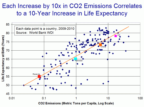
A large number of people seem to assume that our use of fossil fuels is an arbitrary choice among essentially comparable options (or worse, a sinister choice forced on us by the evil oil cabal). In fact, fossil fuels have a number of traits that make them uniquely irreplaceable, at least with current technologies. For example, gasoline has an absolutely enormous energy content per pound of fuel. Most vehicles - space shuttles, and more recently electric cars - must dedicate an enormous percentage of their power production just to moving the weight of their fuel. Not so in gasoline engine cars, something those who are working with electric cars must face every day.
I was careful in the chart to say the two " are correlated". I actually do not think one causes the other. In this case, I think there are a third, and fourth, and fifth (etc.) factors that cause both. For example, economic development leads to (and depends on) increased fossil fuel use and CO2 emissions, and it leads to longer lives.
SOURCE
As Carbon Dioxide Levels Continue To Rise, Global Temperatures Are Not Following Suit
New data from the National Oceanic and Atmospheric Administration show atmospheric carbon dioxide levels are continuing to rise but global temperatures are not following suit. The new data undercut assertions that atmospheric carbon dioxide is causing a global warming crisis.
NOAA data show atmospheric carbon dioxide levels rose 2.67 parts per million in 2012, to 395 ppm. The jump was the second highest since 1959, when scientists began measuring atmospheric carbon dioxide levels.
Global temperatures are essentially the same today as they were in 1995, when atmospheric carbon dioxide levels were merely 360 ppm. Atmospheric carbon dioxide levels rose 10 percent between 1995 and 2012, yet global temperatures did not rise at all. Global warming activists are having a difficult time explaining the ongoing disconnect between atmospheric carbon dioxide levels and global temperatures.
This isn’t the first time in recent years that global temperatures have disobeyed the models presented by global warming activists. From the mid-1940s through the mid-1970s, global temperatures endured a 30-year decline even as atmospheric carbon dioxide levels rose nearly 10 percent. From 1900 through 1945, by contrast, global temperatures rose rapidly despite a lack of coal power plants, SUV’s, and substantial carbon dioxide emissions.
Remarkably, global warming activists are spinning the ongoing rise in atmospheric carbon dioxide levels, along with the ongoing lack of global temperature rise, as evidence that we are facing an even worse global warming crisis than they have been predicting.
“The amount of heat-trapping carbon dioxide in the air jumped dramatically in 2012, making it very unlikely that global warming can be limited to another 2 degrees as many global leaders have hoped,” the Associated Press reported yesterday.
Actually, the fact that temperatures remain flat even as carbon dioxide levels continue to rise is a devastating rebuke to assertions that rising atmospheric carbon dioxide levels are causing a global warming crisis.
On a related front, the NOAA data amplify the futility of imposing costly carbon dioxide restrictions on the U.S. economy in the name of fighting global warming. U.S. carbon dioxide emissions declined 10 percent during the past decade, yet global emissions rose by more than 30 percent.
Regardless of the future pace of ongoing reductions in U.S. carbon dioxide emissions, global carbon dioxide emissions will continue to rise. Even if the United States committed economic suicide by imposing all or most of the carbon dioxide restrictions advocated by global warming activists, the ensuing U.S. carbon dioxide reductions would amount to merely a drop in the bucket compared to the flood of emissions increases by the world as a whole and by developing nations such as China and India in particular.
SOURCE
Sea surface temperature going nowhere
The global average sea surface temperature (SST) update for Feb. 2013 is -0.01 deg. C, relative to the 2003-2006 average: (click for large version)
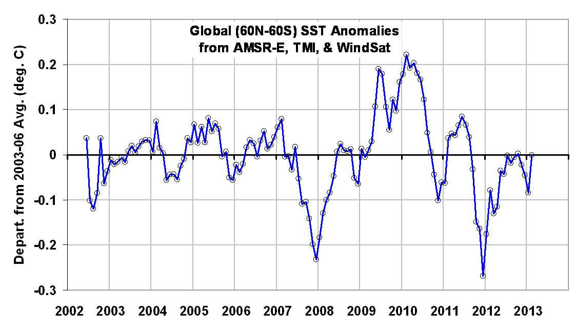
The anomalies are computed relative to only 2003-2006 because those years were relatively free of El Nino and La Nina activity, which if included would cause temperature anomaly artifacts in other years. Thus, these anomalies cannot be directly compared to, say, the Reynolds anomalies which extend back to the early 1980s. Nevertheless, they should be useful for monitoring signs of ocean surface warming, which appears to have stalled since at least the early 2000′s. (For those who also track our lower tropospheric temperature ["LT"] anomalies, these SST anomalies average about 0.19 deg. C cooler over 2003-2006.)
The SST retrievals come from Remote Sensing Systems (RSS), and are based upon passive microwave observations of the ocean surface from AMSR-E on NASA’s Aqua satellite, the TRMM satellite Microwave Imager (TMI), and WindSat. While TMI has operated continuously through the time period (but only over the tropics and subtropics), AMSR-E stopped nominal operation in October 2011, after which Remote Sensing Systems patched in SST data from WindSat. The various satellite datasets have been carefully intercalibrated by RSS.
Despite the relatively short period of record, I consider this dataset to be the most accurate depiction of SST variability over the last 10+ years due to these instruments’ relative insensitivity to contamination by clouds and aerosols at 6.9 GHz and 10.7 GHz.
SOURCE
UK's Centre for Ecology and Hydrology says rainforests will survive climate change
NEW research has challenged "catastrophic" climate change forecasts for the world's tropical rainforests, instead predicting that they will survive even if greenhouse gas emissions aren't cut.
An international team of computer climate modelling experts found rainforests in Asia, Africa and the Americas would not dramatically shrink, in contrast to warnings, including those from Australia's Chief Climate Commissioner Professor Tim Flannery, that global warming was a catastrophe for tropical rainforests.
The new research says the ability for rainforest plants to adapt to climate change has been underestimated.
Professor Flannery last year said "rainforests are also being stressed by the warming, with many species at their limits of temperature tolerance and facing increased risk of extinction," as the Climate Commission unveiled its 14th report on global warming.
But the new research, led by the UK's Centre for Ecology and Hydrology, used 22 climate modelling computer systems and programs incorporating plant biology to explore the response of tropical forests in the Americas, Africa and Asia to greenhouse-gas-induced climate change.
"A number of previous analyses have investigated potential vulnerability of tropical forests under climate change. Some ... suggest that anthropogenically induced climate change across Amazonia could cause catastrophic losses of forest cover and biomass - die-back," the centre's peer-reviewed report, published in Nature Geoscience, said.
"We find the possibility of climate-induced damage to tropical rainforests in the period to year 2100 ... might be lower than some earlier studies."
"There is also increasing evidence that the long-term temperature response of respiration (in plants) is dynamic, capable of thermal acclimation (adaption to changing temperatures).
"Generally, acclimation, again not yet included in any major land surface model, is believed to mitigate the rate of increase in respiration rates (the amount plants breathe) in the event of a transition to warmer temperatures.
"There are suggestions that photosynthesis can also acclimate to rising temperatures, although the extent to which this might occur in tropical forest species remains unknown."
The research said rainforests would not be destroyed by 2100 even in a "business-as-usual" scenario where industry does not cut emissions.
SOURCE
***************************************
For more postings from me, see DISSECTING LEFTISM, TONGUE-TIED, EDUCATION WATCH INTERNATIONAL, POLITICAL CORRECTNESS WATCH, FOOD & HEALTH SKEPTIC, AUSTRALIAN POLITICS, IMMIGRATION WATCH INTERNATIONAL and EYE ON BRITAIN. My Home Pages are here or here or here. Email me (John Ray) here.
Preserving the graphics: Graphics hotlinked to this site sometimes have only a short life and if I host graphics with blogspot, the graphics sometimes get shrunk down to illegibility. From January 2011 on, therefore, I have posted a monthly copy of everything on this blog to a separate site where I can host text and graphics together -- which should make the graphics available even if they are no longer coming up on this site. See here and here
*****************************************


 Jim Hansen and his twin


No comments:
Post a Comment